In this exclusive interview, CEO Kai Hattendorf shares insights into the recent UFI brand refresh and the story behind the new logo, which were both revealed in October 2024. Discover the vision and strategy that inspired this transformation, and how it aligns with UFI’s commitment to leading the exhibition industry into the future.

What inspired the decision to refresh UFI’s visual identity at this point in time?
Kai: UFI’s previous logo and brand identity were introduced early into this century when UFI underwent a major repositioning. Back then, the brand’s redesign was all about supporting UFI’s growing global reach and role.
Almost a quarter of a century later, UFI has grown, changed, and evolved a lot. It now has regional offices around the world, four activity pillars, and many products and services for our global membership and the industry at large.
It is a testament to the great work done back then that the previous UFI appearance stood the test of time for this long and could be stretched far into a much more digital presence. But on the eve of UFI’s 100th birthday, it was time to rethink and reimagine what UFI looks like to ensure future success in an ever-more digital environment.
Can you share some insights into the creative process behind the new logo design?
Kai: In the past two years, we have assembled a great MarComs team at UFI HQ – Pierre-Aurelien, Molly, and Noor. They are digital natives with a passion for exhibitions. They are the generation that will shape the next 20, 30 years of our industry, and so we trusted them to shape UFI’s visual future here.
Together with Admind Branding & Communications, they guided me and the team through an inspiring journey that led us to the new visual identity, which will now serve us in a mainly digital-first future of communications and marketing.
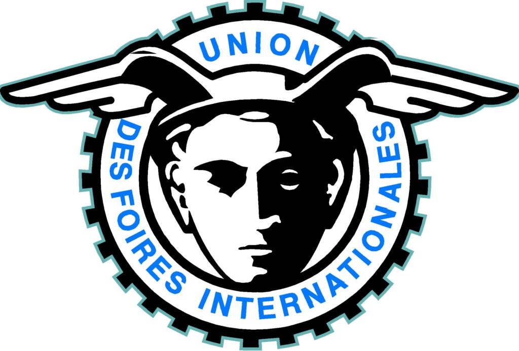
We (re)discovered the visual legacy of the past 100 years, going back to UFI’s first-ever logo from 1947, and combined legacy, presence, and visions for the future to arrive at the new visual identity.

How does the new logo reflect UFI’s mission and values today, compared to the previous visual identity?
Kai: One of the global visual symbols of our industry is a depiction of Hermes, the Greek god of trade (the Roman equivalent is Mercury), usually shown wearing either a winged helmet or winged shoes. UFI’s very first logo from 1947 centres on Mercury’s head and helmet. The 2003 logo shows this in a very abstract way, the stripes being the helmet wings, and the round bend with the dot forming the face, but very few people are still aware of the connection. Now, we bring back the helmet’s wing as the central visual element, connected with the new UFI font, reflecting our organisation’s legacy
The wing consists of four strands or feathers, representing the four pillars of UFI’s work for its members and the global exhibitions and events industry: Events, Research, Education, and Advocacy. Its green colour represents the sustainable and long-lasting positive impact of exhibitions for businesses, destinations, and societies as well as a perennial optimism that a greater good is achieved when people meet across borders and cultures. The logo also uses a modern and clean font that is optimised for use across digital channels as well as in its physical appearance.
Looking forward, how does this visual refresh set the tone for UFI’s next chapter?
Kai: It does not so much set the tone, but it supports and strengthens UFI and UFI’s work. A brand and its appearance are always an expression of an institution’s identity, beliefs, values, and priorities.
The “secret” of UFI’s success is this focus and purpose, shown by the commitment of so many industry leaders from all around the world for already one full century. UFI’s full name is “The Global Association OF the Exhibition Industry,” and to succeed in that, we must every day be the global association FOR the exhibition industry.
UFI means something to many people and businesses. I learned that when we produced UFI pins for an event, and many people asked for one because wearing it meant something to them. That is how a brand can represent an idea and a community.
And yes, we will have pins with the new logo on hand at the UFI Global Congress in Cologne.


Leave A Comment